Insight Presentation
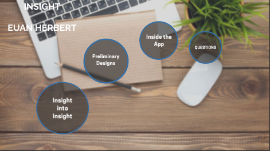
Transcript: INSIGHT EUAN HERBERT What is Insight? Insight into Insight Insight is an interior design app, which has a range of different interior design features such as Photo Galleries and Rendering modes. The app is designed to allow users to design their home virtually, without spending a penny. Why we made the app Why was the app created The Insight app was designed as their is a gap in the market for an app like this, where users can virtually design their home and gain inspiration. This app is able to virtualise, inspire and motivate the audience to create and design their dream home. Potential target markets The potential target market for the app would be users in the age range of 18-30 as most tend to be buying/moving houses, who are good with technology. Potential Target Markets Preliminary Designs PRELIMINARY STAGES In the beginning, I started designing ideas that my client was looking for. I used a combination of client feedback along with survey results to ensure I could come out with the best possible outcome for the app. I created a set of preliminary designs to gain an idea of what Insight would become. Preliminary designs Some Preliminary Designs For these preliminary designs, I was looking to get a grasp of what the app will be like. So I had to gain feedback from clients and surveys. This meant I could find the color schemes and themes for the app. Feedback and Surveys Gaining Feedback and surveys. I used a focus group of pupils in my class to gain feedback on who might be interested in the app and what they might like to see in it. I also used surveys to gain feedback on what app features might not be useful or will not be of use. This helped to find the best outcome for the app. I also used my client to gain feedback, so i could integrate their needs with the public feedback to get the best outcome for the app. Inside the App My app includes - Initial loading page - This page will load into the home screen, which can take you to all the other available pages. - Insight color's are blue and white primarily. Next Pages Home page & Photo library Home Page The home page is the first page where the user will be greeted with, where they can choose to go to any other page from their. The user can further go to the photo library, which is a very large photo bank of images to give inspiration to users. Photo Library Further Pages 1. 2. This floor plan layout page allows the user to design a floor plan, and further decorate the interior to see sizes and what could go where, without having to leave their home. Further app features 3. This is the users custom profile page. On here, they can save photos and renders they might like or want to view later. They can also customize profile pictures etc. On the photo mode page, users can take a photo of their own home which can further let them add a photo into the photo library. This allows users to share their creative ideas with the rest of the community. Extra Feature 4. The 3-D render page is a page where the user can let loose, and design their room with no care about budget or mistake, as they can place furniture and simply delete it if they do not like it. This is a virtual room designer so the user can visualize their ideas and bring them to life without spending money. Further app features CONCLUSION QUESTIONS To conclude, The app insight has come through a long development stage to come up with this final design, which both myself and my client are very pleased with. Thank you for listening, any Questions?


