Drawing 1-Final Powerpoint
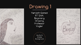
Transcript: Drawing 1 Yamileth Gomez RT 124A: Beginning Drawing Professor Vogler My Bio & Artistic Background My Bio & Artist Statement Formal Art Experience: - Took a painting, drawing and ceramics class in high school Future Career Interests: -Work at an art gallery or become an art teacher Current Goal: -Get Associate's Degree and major in studio arts -Transfer to a university to get my Bachelor's Degree What I Have Learned & Accomplished Use of Different Techniques -Hatching -Cross-Hatching -Continuous -Shading -Painting (Water Color) Chiaroscuro -The balance in lighting and emphasis on shading to create a realistic, intense, and dramatic effect. Surrealism -Incorporate fragments of reality into an artwork. Applying Elements & Principles of Design in Art Work -Lines -Space -Value -Shapes I would compare and contrast my art work "Ink on a Pedestal Table" to Picasso's famouse painting "Large Still Life on a Pedestal Table" created in 1931 in Paris. This art work is a replica of Picasso's original piece except I used ink on a 18 x 24 drawing paper instead of using oil based paint on a large canvas. Even though it is not as vibrant and lively as the orginal piece is, my drawing is still able to capture different shades of greys, blacks and whites. How would you compare & contrast your work to the artist you have researched? Elements of Art & Principles of Design Lighting Techniques Drawing Hands Surrealism in the Arts Bruneleschi Cubism Color Theory Studio Projects This project was based on an important element, lines, and how we learned how to use them. It piece consists of: hatching, thick and thin lines, curved lines, spirals, and bent lines. Title: "Elements in Sight" Dimensions: 18 x 24 in. Tools Used: Thin Ink Pen, Thin Sharpie, Ruler Title: "Differences of Four" Dimensions: 18 x 24 in. Tools Used: Thin Ink Pen, 2H & HB Pencil, Ruler, Water Color (B&W) This project was based on the chiaroscuro effect, which adds a dimension of depth to objects. A lighter surface, shade, shadow, reflection, and a cast-shadow are shown in this drawing. Title: "Manipulation of Objects" Dimensions: 18 x 24 in. Tools Used: 2H, HB, B Pencils This project still involved the chiaroscuro effect but involved still life and shading. Objects were overlapping, which made certain proportions, values and textures seem one way up close and another way from a distance. Title: "Flowers in Style" Dimensions: 18 x 24 in. Tools Used: 2H and B Pencil, Ink Pen, and Thin Sharpie This project involved a modern art style and was inspired by M.C Escher with his drawing hands piece. The hand is the main focus of this piece while the flowers add some patterns to the whole drawing. Title: "Fancy Whiskers" Dimensions: 18 x 24 in. Tools Used: Black Conte Crayon This project was based on the animal in you, which involved surealism. This art movement plays with the concept of reality and dreams, this can be interpreted with the cat having human like features and clothing. Title: "Slanted Cityscape" Dimensions: 18 x 24 in. Tools Used: HB and 2H Pencil For this project, we used bruneleschi, points that create perspective shapes. I used 2 point perspective for the buldings and there were 2 vanishing points that connected towards the center. Title: "Ink on a Pedestal Table" Dimensions: 18 x 24 in. Tools Used: Thin, Black Ink Pen This project was inspired by Picasso's original oil based painting called "Large Still Life on a Pedestal Table". The art movement is cubism and it was meant to be representational, which came up in the 20th century because of Pablo Picasso and Georges Braque. Title: "Mannequins in Action" Dimensions: 18 x 24 in. Tools Used: Brown Conte Crayon, Thin, Black Ink For this project, I had to put wooden mannequins in an environment with perspective. I chose to use the brown conte crayon to give this piece a wooden-like look all around. Title: "A complementary Look" Dimensions: 18 x 24 in. Tools Used: Water Color Paint This project was a self-portrait that was meant to give off color theory effects, which was complementary in this case. I used shades and tints of orange and blue to add to the overall look of the image represented in this piece. Title: "Collision" Dimensions: 18 x 24 in. Tools Used: Water Color Paint In this project, abstract was the art movement that inspired this piece to come together with complementary colors. I chose to use shades and tints of orange and blue because it adds playfulness to this messy art work.


