Skyline
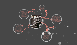
Transcript: The skyline features pull quotes and lines to attract the reader. This is one of the initial points of interest for a lot of readers, as it is common to start reading something from the top down, though with a magazine these rules don’t often work in the same way. However, the use of these quotes adds to the general attractiveness to the chosen audience, and displays itself as important by being at the top. Furthermore, in the event of magazines being stacked in front of each other, the skyline will be seen and intrigue readers if the information is relevant to their interests. Just to the left of the text on the skyline is a tattered (showing more relevance to the genre) circle of which tells us that there is a ‘Free CD’. This is presented in clear and completely oppositely coloured text (also in capital letters) so that the reader will be able to see it clearly, adding to the cover’s appeal. Furthermore, the buzz-word freebie mentioned is not only at the top, but the left, meaning that in any stacking fashion used the circle will be fully visible. The title is a tatty mix of white and slight brown, as if tarnished or aged material had been cut into the shape of the letters. The letters are in block capitals and are not exactly ‘neat’, as well as being half covered by the man shown. The fact that the title is so obscured indicates that the magazine’s title is something that remains the same through the issues, and so is recognised easily by regular readers. Also, the text possesses the style shown here as it shows much relation to the genre, possessing messy outlines, mixed and imperfect colour as well as the use of capitals to show boldness and abrasiveness. Text of the band’s name ‘Emperor’ is shown the way it is due to it being the band’s property and identity; it’s almost like a signature, and should be kept this way accordingly. The rest of the text consists of quotes related to stories, or directly to this man. This shows us that the magazine features mainly news of the metal genre, opposed to ‘Metal Hammer’s’ affixation on their fans. The man shown on the cover has been edited, or the camera has taken the picture in black and white, so as to retain the house style and (colour) theme of the cover. He is also looking directly into the camera; a style of which is often used in magazines so as to make some form of contact with the reader. Furthermore, the shot is not quite a headshot, but slightly zoomed out so as to include some height to the photograph to fill the page, and to include the iconic necklace. His expression is also very unbiased and emotionless, as well as his hair being pulled back and his clothing showing no vibrant colours or words to convey a sense of seriousness which goes well wtih the quote beside it, "Black Metal isn't a sound, it's an attitude." Background The background does not consist of much, however is completely appropriate to the house style and theme of the rest of the cover. The background features a dark grey base with a lighter grey smokiness, retaining the dark colours and smooth shapes so as to maximize visibility and solidness of the images and text. The fog becomes slightly lighter around the model to allow for a solid outline of his image, and also seems to emerge from behind his body. This effect connotates with emerging, rising, and looks as if the smoke has a cause of which is likely linked to the quote beside him, representing 'The return of Emperor'. Skyline Further Content 'Terrorizer' magazine features content on the cover related to the fans and frequent buyers; Band names are mentioned, along with a short subheading or succinct quote so as to pull the audience in. Only subscribers or those interested in the genre of music would be able to identify these bands and story references, therefore establishing the necessary need to be a fan of the music genre, and the fact that this magazine can't just be picked up by anyone. There are no social networks mentioned, as the magazine mainly uses their own website of which is mentioned in a good area of vision (just under the freebie stamp so as to ensure it can be seen when stacked on shelves). There is also the issue number just below, and this remains constant through the issues so as to allow a familiar layout, making it easy to navigate the page once familiar with the magazine. Text Model


