Creating Design Presentation Boards
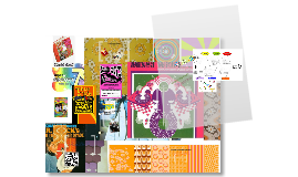
Transcript: Use Typography as a Tool "Transparency can serve to emphasize values of directness and clarity through adjustments and juxtapositions that maintain the wholeness or legibility of elements. Transparency also can serve to built complexity by allowing layers to mix and merge together and can be used thematically to combine or contrast ideas, linking levels of context." http://www.gdbasics.com/html/transparency/transparency.html "Layers allow the designer to treat the image as a collection of assets, a database o possibilities" Layers allow you to create depth in a presentation, show subliminal messages or imagery and enhances the complexity of your project. http://www.gdbasics.com/html/layers/layers.html Hierarchy Why is this critical? Design Boards are the primary method of sharing information and ideas. Your client see's the design board, not necessarily the hours and hours of work you have done behind the scenes. Lydia Smolin ART 3340 - MWF 10:00-11:50 Creating Design Presentation Boards The Good,the Bad and the Ugly What do we like? Dislike? What is successful and where could there be improvement? Layers Less is More vs. Less is a Bore Text is a Tool, but one that should be used tactically. While your body of text in your presentation board needs to "speak" for you.... Say the most with the least "The order of importance within a social group or in a body of text" Hierarchy may be expressed through naming systems or conveyed visually through variations in scale, value, color, spacing, placement, etc. Regardless of approach, hierarchy employs clear marks of separation to signal a change from one level to another. http://www.gdbasics.com/html/hierarchy/hierarchy.html Transparency


